Selfie Mirage | Denver, Colorado
The main purpose of Selfie Mirage is to be a fun, unique place to come take selfies where they walk away feeling happy and having a memory keepsake. With unique themes and backdrops to foster creativity in its patrons, we created a brand + website that embodied the ideas of fun, individuality artistry, and vibrancy. From colorful accents & backgrounds, to funky hand gestures coming at you, this brand is sure to bring a smile to anyone's face that encounters it.
BEHIND THE LOGO:
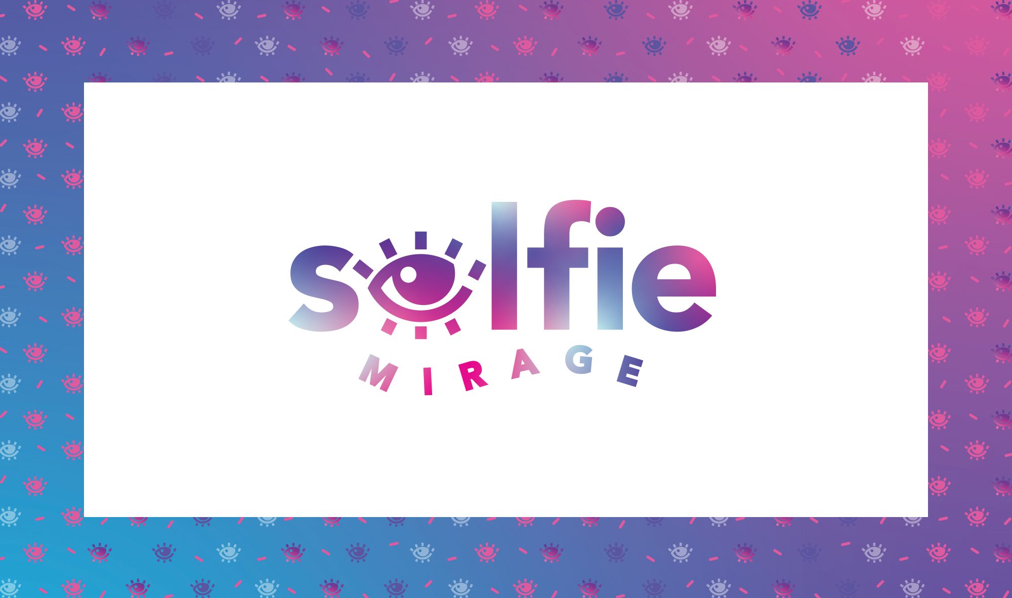
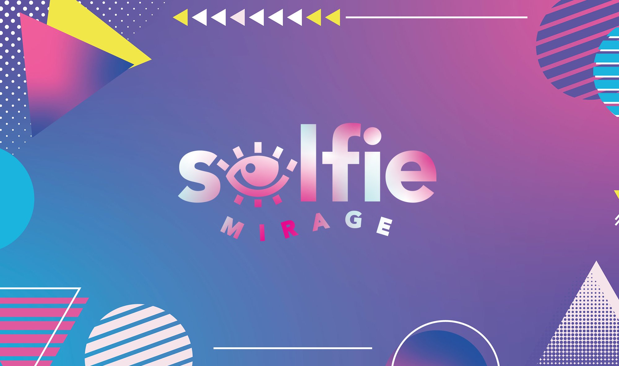
The Selfie Mirage logo is an homage to art, fun, and the avant garde. The focal point of the logo is the eye icon that takes the place of the letter 'e' in SELFIE to draw you in and speak to a celebration of beauty. The gradient application adds vibrancy and gives it a unique, cheeky vibe.
The font was selected for its modern and happy appearance making a strong impact. The letters in the word MIRAGE create a wave that hugs into the eye icon and solidifies the creativity of the brand.
WHAT WE DID:
Creative Direction
Mood Board
Tagline Development
Custom Logo System
Color Palette & Usage
Typography & Hierarchy
Brand Guidelines
Brand Accents
Signature Texture
Branded Patterns
Business Cards
Website Content Strategy
Website Design & Development
Logo Design, Visual Branding, Web Design for Selfie Museum
"Lindsey was wonderful to work with! Always on top of things, she has wonderful vision and implementation. I would suggest her to anyone looking for a showstopper of a website."
Eve Edwards // Creative & Owner, Selfie Mirage

ready to do this whole brand + website thing?
SCORE YOUR FREE CONSULT IN 3 QUICK CLICKS
▼
